Showing posts with label home computers. Show all posts

14/11/2018

TENNIS COMPUTER GAME COVERS

I think it’s about time for more home computer sports game covers, don’t you? Whaddya mean, “no”? It’s too late now, I’ve already gathered together a bunch of cover art from tennis games and I’m not going to let all that back-breaking effort go to waste. Previously I’ve checked out cover art from “sporting” genres such as snooker and chess, but tennis feels like an especially appropriate sport to look at because hey, Pong is essentially a tennis game, right? And Pong is such a milestone in the development of videogames that making dumb jokes about the cover art of the games it spawned is basically the same as doing important academic work. I'm a historian! Cool, I’ve convinced myself. Let’s get to it, then!

Tennis Cup, Amiga, Loriciel


Immediately I realised that the concept of this article might be fundamentally flawed, because there’s only so much I’m going to be able to say about images of people wearing all-white outfits and holding tennis racquets. I suppose I’ll just have to zero in on the finer details, like the way the guy on the left is holding his racquet in a way that suggests he’s preparing for an overhead chop. I could create an elaborate backstory to explain this, one where he grew up in an isolated mountain cabin until one day he was spotted by an ageing tennis coach who realised the young man’s firewood chopping technique could be converted into a phenomenally powerful backhand. Hire me to write your sports anime, please.
However, what really stands out to me is just how incredibly smooth and hairless everybody’s legs are, especially the chap in the centre. He must be at least twenty-five percent dolphin.

Konami’s Tennis, ZX Spectrum, Konami / Imagine


More smooth legs on display here, too. I thought it was swimmers who removed all their body hair?  Are all professional tennis players competing in these tournaments in the hope of winning enough money to pay off the crippling debts they owe to Veet? I’m not complaining really, this is a perfectly good piece of artwork from prolific computer game artist Bob Wakelin. It’s got movement, precision, a weirdly out-of-place desert chrome logo and the guy on the right’s foot is dissolving away into nothingness. What more could you ask for?

Konami’s Tennis, MSX, Konami


Over on the cover for the MSX version of the same game, we see some very unsporting behaviour as one player celebrates hitting her opponent in the head with the ball. There’s definitely something nasty about that character, as though they revel in the pain of others. Between her single tooth and the fact she’s literally sticking two fingers up at the player, she’s got the air of a petulant baby-person. The on-court tantrums of John McEnroe in the body of a weird pop-art baby with a serious case of Popeye Elbows, that’s what this cover is all about.

International Tennis, ZX Spectrum, Zeppelin Games


Full marks to the artist on this one for taking on the difficult task of making a tennis game look “international” by covering the player in a variety of national flags. Some of the flags might look a little strange – I’m not sure what’s going on with that starless, six-striped US flag beyond the artist understandably not wanting to draw all those stars – but it gets the point across. If that wasn’t enough, there’s a world map printed on the tennis ball. Yes, the only way this could have more succinctly conveyed the idea of international tennis is if it was a picture of the very continents themselves holding tennis racquets, which is what I would have done. Antarctica would have been the umpire.

Advantage Tennis, Amiga, Infogrames


Now here’s a cover I do genuinely like. Sure, it’s painfully nineties with a colour scheme that reminds me of buying packs of highlighter pens during the back to school shop and then never using them, but at least it’s not smooth-legged people in white clothes. The stark background and logo makes for a nice contrast with the colour and fluidity of the chalk drawings, and if you ever needed a theme for a music video to go with an eighties song about tennis, then here you go. Not that there are many eighties songs about tennis, of course. There’s Chris Rea’s “Tennis,” I suppose, but that’s not really about tennis. Nice bass riff, though. Where was I? Oh, right, tennis covers.

On-Court Tennis, Commodore 64, Activision


This chap seems confused that someone has written a bunch of cryptic information on the tennis ball he’s trying to hit. “What is this ‘flash load’?” he ponders as he prepares to slice the ball back over the net. Unfortunately for him he will never be a world-class tennis player, because this artwork clearly depicts him as having hair on his arms. With the extra drag this generates he won’t be fast enough to compete against his hairless rivals.

Match Point, Commodore 64, Psion


Here we see a tennis player whose nickname is undoubtedly “The Underbite.” Captured in this image is The Underbite’s sudden realisation that maybe he should have brought a full-sized racquet to this match instead of the Action Man accessory he’s currently using. Speaking of Action Man, this image looks like it was taken straight from the cover of a sixties or seventies “men’s magazine,” except instead of surviving a World War II ambush or hunting big game he’s getting some healthy exercise down at the local tennis club before heading back to job at the council.

Tournament Tennis, Commodore 64, Imagic


Have you ever wondered what a statue of a tennis player carved from glistening, meaty dog food would look like? No, me neither, but here we are. This is the terrible knowledge that we both now share. I wonder what the thinking behind this particular aesthetic choice was? An attempt to create the ur-tennis-player, perhaps, one that exhibits protean strength and finesse, one that belongs to no single race or creed? That could be the case. Equally the artist could have been eating a treacle sponge while doing the artwork and, having dropped a big dollop of their dessert onto the paper, they decided to work it into the art. Whoever this mysterious player is, they’re in a for a real surprise when they realise that’s not a tennis ball coming at them, and someone’s whipped a cue ball towards them instead.

International 3D Tennis, ZX Spectrum, Sensible Software


I showed this one in an earlier sports game covers article, but I can’t leave it out. I just really like the idea of a tennis game cover that captures the exact moment a player suffers a horrible ankle injury. Not in a mean way, I hasten to add. I just think it’s weird, is all. I also think this player looks like unthreatening pop-jazz musician Jamie Cullum. Perhaps the broken ankle is punishment for Cullum’s anodyne cover of Jeff Buckley’s ‘Lover, You Should Have Come Over.”

Jahangir Khan World Championship Squash, ZX Spectrum, Krisalis Software


I figured I’d chuck in a few covers from adaptations of other racquet sports, because why not? What is squash if not a game of tennis played against a wall? I’m sorry, any squash players who might be reading this, I’m sure you hear that kind of unfair dismissal of your chosen sport all the time.
So, here we’ve got to blokes playing squash, which is fair enough for the cover of a squash game. Leg-hair status: just as bald as tennis. The guy on the left’s leg is so smooth that it’s producing a blinding glare with which he can dazzle and disorient his opponent, which I’m sure isn’t technically against the rules of squash but is certainly rather poor sportsmanship
I say “that guy,” but of course he’s the eponymous Jahangir Khan, a man who was certainly a squash champion. How much of a champion? Well, according to his Wikipedia page, Khan won five hundred and fifty-five squash matches. In a row. A five-and-a-half-year unbeaten streak. At that point you have to wonder whether all the other squash professionals’ hearts were really in it any more. “A tournament’s coming up, huh? Oh, Jahangir Khan has entered. You know what, I think I’ll save the air fare.” Khan eventually lost his streak in 1987. After that he went on another nine-month unbeaten run. He was good at squash, is what I’m saying, and he must have been a real easy pick for the star of this computer squash game. Khan is also the uncle of Natasha Khan, better known as the musician Bat for Lashes. I don’t know why this article has ended up containing so much music trivia. Maybe I’ve got a subconscious desire to write about music or something, so let’s give it a try – I’ve been listening to Alice Cooper’s albums that he doesn’t remember making recently, the ones from the deepest points of his struggle with alcohol and drugs, and there’s some fun, weird stuff in there. Check out the track “Skeletons in the Closet,” for example. Okay, hopefully that’s gotten the musical stuff out of my system for now.

Jonah Barrington’s Squash, ZX Spectrum, New Generation Software


Here’s another cover that you might have seen before if you follow me on Twitter, and it might be my favourite of the bunch. It must have taken a huge amount of effort to get a professional athlete to look this uncomfortable. What on earth was the direction behind this piece? “That’s great Jonah, we’ve got some good action shots, but what if you pretended to be trapped in a giant, invisible baby bouncer? I feel that could really work as a concept.”

Superstar Ping-Pong, Commodore 64, SilverTime


Ping Pong also gets a seat at this table, of course. Not an especially interesting cover on its own, the real charm of Superstar Ping-Pong comes from that advertising blurb. “The potential of a ping-pong game has at last been realised” is such an overblown statement that it’s impossible not to love, as though there were millions of die-hard table tennis fans out there thinking “soon the computers will be able to recreate the game we love with perfect fidelity, and when that day comes we can at last fold up our ping-pong tables and put them away in the garage forevermore. No longer will we suffer the tyranny of not having enough space to play table tennis! This glorious day is soon at hand, my brothers and sisters!”

Table Tennis Simulation, Atari ST, Starbyte


You might be thinking that’s it’s not going to be an accurate simulation of table tennis if you’re playing as a tortoise, and you’d be right. Have you seen how fast top-level ping-pongers go at it? No, I think this cover is actually a clever piece of expectation management. By showing you tortoises right out of the gate, the game is subtly conditioning you to not be surprised when the actual game runs really slowly. Crafty, very crafty.

Ping Pong, Commodore 64, Konami / Imagine
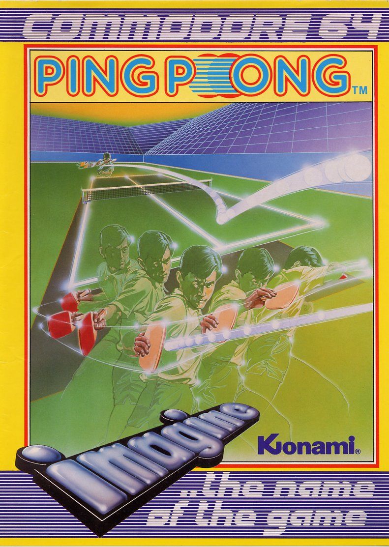

A much better cover here, as you might expect from a company like Konami. There’s almost a martial arts flavour to it, I reckon. Mind you, that might be because I’ve been playing Fist of the North Star: Lost Paradise recently so when I see people leaving ghostly after-images of themselves when they move, that’s what I’m reminded of. Still, I feel like if you changed the background and airbrushed out the paddles you’d have a perfectly acceptable cover for Yie Ar Kung Fu.

Tiebreaker, Commodore 64, Kingsoft


The more you look at this cover, the more bizarre it gets. Just how long is that net? Why has the player gently knocked the ball straight to his opponent instead of trying to score a point by blasting it into the vast unoccupied space provided by this huge circular court? Are the insurers of this event not worried that one of the players might injure themselves by colliding with the six-foot tall trophy that’s right in the play area? The plaque on the trophy implies that the current holders are Kingsoft themselves, so we’re left to assume that they’ve created their own bizarro version of tennis in an attempt to spice things up.

Serve and Volley, Commodore 64, Accolade


I feel like the artist on this one ran out of energy just before they got to the racquet. Everything else is perfectly fine, but the racquet seems to have been painted on in Tipp-Ex. Unless… that’s the ghost of a tennis racquet?

Passing Shot, Commodore 64, Sega / Image Works


Definitely the most boring cover I’ll show you today is this re-release art for Passing Shot. It’s... a tennis ball. This is a tennis game on the Commodore 64, and that’s more than enough to give you a very strong idea of how it’s going to play. However, there is that title logo, and if on first glance you read it as Passing Shot and not Passing, erm, something else, you’re a better person than I.

Real Tennis, MSX, Takara


To finish the article, let’s quickly look at a selection of fascinating faces, starting with this one where a young man has suddenly arrived at the realisation that he’d rather be doing anything else with his life than playing tennis. “Aww geez, he’s hit the ball back towards me again,” his expression seems to say, “how long will this nightmare continue? I could be at home watching YouTube videos of motorsport accidents!”

Grand Slam, Amiga, Infinity Software


Look at this doe-eyed youth, fresh of face and lean of limb, a slight smile on his lips. That’s how you know he’s not a real sportsperson, they don’t tend to smile while they’re actually playing their sports. You wouldn’t either if you went through the same training regimen as a pro athlete.

Jonah Barrington’s Squash, Commodore 64, New Generation Software


Finally for today, this alternate cover for Jonah Barrington’s Squash reveals the true emotion that squash brings to the surface – pure, undiluted terror. These men are clearly very frightened of what’s going on around them, the icy claw of horror scratching at their hearts as the walls of the squash court seem to press in on them. I can only assume that the winner of this match has to face Jahangir Khan next.

03/10/2018

SPOOKY COMPUTER GAME COVERS, PART II!

Two of my absolute favourite things to look at with my human eyes are old computer game covers and horror-themed artwork, so obviously I had to write another article about spooky home computer game covers. Computer game covers from the eighties and “Halloween” artwork of the kind you might find on an old horror VHS or the packaging for plastic witch fingers – they both draw from a deep well of enthusiastically amateurish illustration which, to me, speaks to the very core of the Halloween season’s appeal. I hope you’re ready for a gaggle of ghosts, some distinctly un-threatening vampires and logos drawn to resemble all manner of bodily fluids!

Haunted House, TRS-80


Oh yeah, that’s the stuff. As much as I enjoy the more over-the-top examples of horror cover art, there’s still plenty of room in my heart for something like this – a straight-forward evil mansion with a Bates Motel flavour and the title “Haunted House” in a dripping, ectoplasmic typeface. Who knows what terrible evil lurks behind the attic window of… the haunted house! Okay, so it’s probably ghosts, what with the haunting and all, but still.
One of the benefits of releasing your spooky computer game way back in the late seventies was that titles as straightforward as Haunted House were still available. The large amount of time I’ve spent playing spook-themed hidden object games tells me that nowadays it’d probably be called Ghostly Residence: Cursed Secrets or Cursed Ghosts: Resident Secrets or something very similar.

13 Ghosts, TRS-80


Also appearing on the TRS-80 is 13 Ghosts, with a cover that is a flat-out lie. There are only nine ghosts on display here. Ten, if you’re willing to believe that’s the ghost of a spider. I don’t mind too much, though, because they’re all pretty great ghosts. Somehow the ghost at the front manages to look extremely French, perhaps because he’s managed to retain his moustache after death. I guess you could call it a boostache, if you didn't care that your thoughtless words might cause physical pain to those that hear them.

Waxworks, Dragon 32 / 64


Johnny Stripedtie was a mild-mannered bank clerk with a steady job and a loving family – until the fateful day when the disapproving ghosts of Lincoln and Shakespeare commanded him to clean out the long-neglected fridge of… the waxworks! Can Johnny defeat the dread menace of a potato salad birthed in some long-forgotten aeon? Also Henry the Eighth is there. Trying to get to the fridge, presumably.

Bubble Ghost, Atari ST


Bubble Ghost is a game about a cute little spectre who has to guide a bubble through a mansion of bubble-bursting hazards by blowing on it. It is a surprise, then, that the game ended up with this cover for its Atari ST release. That’s not a cute ghost at all. That’s an angry ghost, a ghost with cheekbones that’d make a catwalk model jealous, a ghost that may well be constipated. It’s been through the “American Kirby game cover” procedure, except the machine was turned up to eleven and we got a ghost whose head has the same silhouette as a cartoon turd.

The Count, Atari Home Computers


Someone had a fun time with the felt-tipped pens, huh? What a great cover, packed with charming details, like the awful “love at first byte” pun, the castle gate being shaped like Dracula’s face and the hammer and stake lying in the driveway. Erm, I think that stake could have done with a bit more whittling, chaps. It won’t pierce the vampire’s heart, it’ll push it right out through his back. I don’t know if the gift-wrapped package is supposed to be to scale and it’s almost as tall as Dracula’s mailbox, but it does seem to contain a reference to the 1970 movie Count Yorga, Vampire. I haven’t seem that particular film, and now I can’t watch it because I’ll just be disappointed when it’s not about two vampire friends who like to buy each other thoughtful gifts. They don’t need a reason, it’s just nice!

The Count, Atari Home Computers


A different cover for the same game, and the “kid’s activity book” feel of the previous iteration has been replaced by a foreboding moonlit castle and an appearance by The Count himself – a fiendish creature of the night who looks as though he could be defeated by walking away from him at a brisk pace. Even if The Count did manage to catch you, his ridiculously large collar would make it impossible for him to get his fangs anywhere near your neck. I think he’s trying to make himself look big to scare away the other vampires.

The Count, VIC-20


Yet another Count, this time appearing on the cover of the Commodore VIC-20 port and hey, he’s handsome now! His collar’s still big enough that you’d be forgiven for assuming The Count’s in the middle of swallowing a large bat, but he’d definitely have a better virgin-enthralling success rate than the previous Count.

The Munsters, ZX Spectrum


Everyone’s second-favourite family of ooky, kooky weirdos got their own home computer game, complete with a cover that is (mostly) the exact kind of thing I wanted to find when I was putting this little collection together. It’s The Munsters as you know ‘em and love ‘em, although Grandpa Munster seems to have been replaced by Ted Cruz. Nice “Herman smashed through it” detail on the front door, too, and it’s even got a strong “horribly good software” pun. My only problem with this cover – and it’s quite a big problem – is the logo. I know it’s a fairly accurate recreation of the Munsters logo, but that was originally in black and white. On this cover, it’s a revolting shade of yellowy off-white that calls to mind pus leaking from infected wounds, gelatinous subcutaneous fat or, even worse, the custard you’d get with a school dinner. I feel quite ill just thinking about it, no matter how much I try to convince myself it’s supposed to be candle wax.

Spooky Castle, ZX Spectrum


Attempting to ward off a ghost with a crucifix? Oh dear, oh dear. What a blunder, the kind of rookie mistake you wouldn’t expect to see from even the most reluctant monster slayer. Everyone knows crosses are for vampires and you get rid of ghosts with either an exorcism, by completing the unfinished business that tethers them to the mortal realm or by sucking them up with a vacuum cleaner.

Frightmare, Commodore 64


I covered Frightmare last time out, and the original release had a relatively restrained cover that recreated the game’s title screen. Then it got a re-release with some far more obvious – but no less appealing – cover art. It doesn’t capture the essence of Frightmare’s gameplay, nor the unsettling dream-world the game tries to conjure up, but it does have a one-armed zombie and a creepy mansion. Three malformed goblinoids drag themselves out of the dirt, and you just know that they’re a right bunch of little shits. They’ve got that look about them, they’re clearly the hellspawned version of mischievous triplets who are forever pulling pranks, except their pranks probably involve eating kittens or stapling thing to tender body parts. I reckon they used to be quadruplets, but they tricked one of their brothers into swallowing a lit stick of dynamite, hence the explosion.

Elvira II: The Jaws of Cerberus, Commodore 64


I must admit, I included this cover purely for the shallowest of aesthetic reasons but come on – just look at that pumpkin! It’s huge, I wonder what it’s made of? Fibreglass, probably. Imagine all the fun you could have with a massive fibreglass pumpkin, like using it to reserve a seat on the bus or as a cage for especially ungrateful trick-or-treaters. Oh, and Elvira is here too. The kitschy, campy horror host and strong contender for the title of Queen of Halloween appeared in several computer games, all of which had cover art that emphasised Elvira’s, ahem, charms. I’m sorry, but it’s impossible to talk about Elvira without slipping into double entendres. It’s kind of her thing. A few years ago she released a Halloween song called “Two Big Pumpkins” and I’m sure you can imagine what that’s about.

Eric and the Floaters, MSX


Two things – no, this isn’t a game about a bloke called Eric who’s having trouble flushing his toilet, and yes, it does look a lot like the cover for Doom, if Doom starred Indiana Jones. Presumably these demons are the floaters of the title, and they’re all scrabbling at Eric in an attempt to grab the delicious baguette hanging from his belt. Yes, I know, you went to look at his belt but got distracted by Eric’s pronounced bulge. In fairness, it does rather catch the eye.

Chiller, Commodore 64


“The foulest stench is in the air,
The funk of nineteen eighty-five.
A grizzly ghoul with press-on nails
Is rising up to scare females.
No mention of the music nicked
from Michael Jackson’s Thriller,
just zombies grinding teeth upon
the cover of the Chiller!

James Herbert’s The Rats, ZX Spectrum


It’s a crying shame that there was never a videogame based on Garth Marenghi’s Darkplace. It could have worked in so many different genres, from graphic adventure to first-person shooter, although I would have most liked it to be a side-scrolling beat-em-up in the manner of Night Slashers. Hmm, I don’t know what suddenly made me thinkof Darkplace.

Frankenstein Jr., ZX Spectrum


To create a monster with the mind of a man from the corpses of the dead is cruel. To then send that abomination to school is beyond cruel, it’s the action of a demented sadist. I knew a kid at school who was bullied because he wore a ponytail, god only knows the kind of abuse Frankenstein Jr. would endure the first time his arm dropped off during a PE lesson. You might be thinking “surely Frank would simply crush the skulls of those who mocked him using his unholy strength?” and he could but you know how it is, when you fight back against bullies you’re always the one who gets into trouble.
I actually really like the artwork on this one, with a cartoon style that makes it look very much as though it was based on a kid’s TV show. There was a kid’s cartoon called Frankenstein Jr., but this game has nothing to do with that.


At last, a game that actually has Halloween right there in the title, plus a cover that stars the witchiest witch I’ve seen a long time, the platonic ideal of witchness - the green skin, the pointed nose, the shoes that are eighty percent buckle. My only issues are that a pointy hat covered in stars is more of a wizard thing, and also her pentagram’s upside-down. Or not upside down, depending on how you look at it. Still, she’s a witch if ever a witch there was. I find myself drawn to her facial expression. Neither the typical evil snarl of someone who stuffs kids into ovens nor the gleeful cackle of a witch excited for the dark sabbath, it’s an expression that seems to say “uhh, I found this key, do you want it?”

Ghosts ‘n’ Goblins, ZX Spectrum


This is a weird one, because it captures a lot of Ghosts ‘n’ Goblins’ features well enough – the rising zombies, the carnivorous plants, the hapless knight about to get drop-kicked into an early grave by a demon bastard – but it looks so different from Capcom’s usual art style that to a more console-based gamer like myself it feels like it fell out of a parallel dimension.
It’s the Red Arremer who has seen the most changes, with the artist mistaking the demon’s wings for a cape. Oh, and he’s furry now. Very furry. We’re talking Muppet levels of fuzziness, and as a result the Red Arremer looks like Elmo from some god-awful “dark” re-imagining of Sesame Street.

The Last Vampire, ZX Spectrum


A very Christopher Lee-looking vampire on this cover, and the game’s hero must have spent more time on his evil-fighting studies than the protagonist of Spooky Castle because he’s waving a crucifix at the correct type of supernatural evil. Admittedly he is putting a lot of faith into his tiny cross, which raises a question: are vampires equally affected by a cross regardless of its size, or does a larger cross have a more potent vampire-repelling effect? Could you defeat a nest of nosferatu by making thousands of teeny-tiny crosses out of communion wafers and sprinkling them through the room like confetti, or would that merely give the vampires the same level of discomfort as wearing a heavy woollen jumper in August? Conversely, if you built a hundred-foot tall crucifix, had it blessed by all the cardinals you could muster and air-dropped it into the Transylvanian countryside, would all the vampires in a fifty-mile radius simply explode? These are important questions, people!

The Astonishing Adventures of Mr. Weems and the She-Vampires, Commodore 64


That’s one hell of a title, but I understand why this re-release cover whittled it down to simply She-Vampires. It’s trying to grab customers browsing the shelves, after all, and if the name She-Vampires doesn’t accomplish that then this cover art probably will. I think what we’re seeing here is the life-cycle of a She-Vampire: you start out as a mouldering corpse, enter a genie-like pupal stage and finally emerge as an Ann Summers model. The red basque is mandatory during all stages, and at no point does being a She-Vampire look comfortable. Awkwardly “sexy” outfits aside, the She-Vampires seem to have too many teeth even for, you know, a vampire. Watching a She-Vampire eat spaghetti would instantly destroy any erotic allure they may have once possessed.
Alternatively, you can choose to read this cover as the “complete” She-Vampire using her cape to stop people peeping on her sisters while they get changed, as one might do with a large towel on the beach.

The House on Damned Hill, ZX Spectrum


Because if you are building a house in a place called Damned Hill, you might as well go the whole hog and erect a massive hollow skull to live in. I’m not sure whether the addition of a wooden roof and porch detract from the terror on not, but the idea of someone or something trying to make their skull-house more of a home by adding a veranda is deeply amusing to me. Maybe rain kept getting in through the nasal cavity or something. You can’t tell from this distance, but I’m going to assume there are curtains hanging behind the eye sockets, and there’s nothing you can do to stop me.


“Gee, thanks for helping me dig up this grave, Mr. Werewolf! I knew I’d accidentally buried my favourite sling down there, now I can get back to practising for this year slingshot tournament! You’re the best, Mr. Werewolf!”

I Spy: Spooky Mansion, Macintosh


Finally for today, here’s the French cover for I Spy: Spooky Mansion. A little more recent that I’d usually allow for this kind of article, but if you can think of a better ending for an article about Halloween-y game covers than a plastic toy skeleton posing jauntily in front of a haunted house then I’d like to hear it. No, seriously. Tell me.

15/05/2018

DONKEY KONG CLONE COVERS

It’s nice that Donkey Kong is still around, you know? Still starring in games all these many years since his 1981 debut, still a big part of Nintendo’s pantheon of videogame legends despite pretty much the only update to his character being that he put on a tie, still taking you through his monkey rap. Here in 2018 it’s difficult to imagine just how phenomenally successful the original Donkey Kong was, but a good indicator is that Donkey Kong is one of the most cloned and copied videogames of all time, and that’s what we’ll be looking at today – a collection of cover art from some of the many, many Donkey Kong rip-offs. If you’re a big fan of poorly-drawn cartoon gorillas – and let’s be honest, who isn’t? - then you’re in for a treat.

Donkey King, Dragon 32


First up is a release for the relatively obscure Welsh home computer, the Dragon 32, and yes, it is called Donkey King. The developer should have gone the whole hog and swapped out the gorilla for the Heehaw Rex, King of the Mules, because it would have given the game its own identity and diverted Nintendo’s lawyers from what is one of the least subtle Donkey Kong clones on this list. It’s got everything you associate with Donkey Kong proudly displayed on the cover: gorillas, damsels, barrels, and by the standards of these covers it’s quite competently drawn, even if Donkey King’s expression suggests that throwing barrels at people doesn’t fill him with the pure sense of joy that it used to. It’s always a shame when your hobby starts to feel like work.

King Kong, Atari 2600


A quick detour into the console market with King Kong, an interesting title because it’s a DK knock-off with an official King Kong license. Universal sued Nintendo after Donkey Kong’s original release, claiming that it infringed on their King Kong copyright by being about a large ape that takes a kidnapped woman to the top of a building. It sounds like a relatively solid legal base, but Nintendo won the case because Universal had previously (and successfully) argued that King Kong was public domain while they were trying to get their 1976 King Kong movie off the ground. Thus soundly hoisted by their own legal petard, Universal ended up putting their name on this King Kong game.
As the biplanes buzz around and a player character who looks a lot like Indiana Jones attempts to scale the Empire State Building, an enigmatic emotion flashes across Kong’s face. It’s not a pleasant emotion either. In fact, it’s the expression of someone watching their parents dance at a family wedding.

Kong, ZX Spectrum


Naturally King Kong is a popular theme for these DK clones, with a lot of them leaning more heavily on the themes of the classic ape-meets-girl tale than even Nintendo’s original does. This cover for Kong is no exception. It’s an okay piece of artwork, I suppose, and I like the perspective on Kong’s… paws? Wait, apes don’t have paws, they have hands, right? Yeah, it’s definitely hands. Any time I see a joke about people having their internet history exposed, I breathe a sigh of relief because I know that if anyone does go snooping through my search history they’re just going to find things like “do apes have paws” and “DK Rap video high quality.”

Kong Strikes Back, ZX Spectrum


Kong Strikes Back isn’t technically a Donkey Kong clone, because it’s actually a rip-off of Mr. Do’s Wild Ride. Still, it’s got platforms, ladder-climbing and a giant ape, so I think it warrants inclusion here. As you can see, it takes place in a theme park full of roller coasters, because even colossal gorillas can’t resist the lure of the Nemesis Inferno. This Kong has a more friendly look about him; something about the cast of his face suggests a more playful nature, although because he’s forty feet tall and weighs about as much as the Sheffield-to-Cleethorpes passenger train “playful” still equates to “terrifying.” Surprisingly small hands (not paws) for a giant ape, mind you.

Monkey Kong, TRS-80


That’s more like it. Those are some appropriately enormous hands, although when combined with the especially long arms and that face this Kong looks more like an orang-utan than a gorilla. That’s fine too, of course. You’ll get no monkey prejudice from me, and I’m sure this Kong can hurl barrels with the best of them.
The blurb’s trying to sell Monkey Kong as an accurate recreation of Nintendo’s original, but I’m not buying it. Just look at the way the characters are posed. All I can see it a gigantic orang-utan that is under Mario and Pauline’s control. I think it’s the blank, dead eyes. He has no style, he has no grace, this Kong also has no free will and his held under the thrall of his captors.

Crazy Kong, Commodore 64


Yep, he looks pretty crazy, and absolutely furious that some idiot is running across his freshly-polished metal walkway in dark-soled shoes. The real craziness comes from this cover’s Mario stand-in, however. What the hell is going on with his skin? The red blotchiness implies that either he’s got a monkey allergy or this metal floor is actually one big cheesegrater and he keeps falling over. Then there’s nose and look, someone has to say it so I guess it’ll be me – it’s kinda phallic. Maybe that’s why this Kong is so crazy; you would be too if some dick-nosed weirdo with a suppurating rash and an ear growing out of his temple started causing you grief.

Killer Gorilla, BBC Micro


Or M.C. Escher’s Donkey Kong, if you like. I’ve spend ten minutes trying to figure out the perspective in this image and all I’ve gotten out of it is a headache, so let’s instead focus on the fact that this game’s Mario analogue realised he had to fight a giant ape and turned to his trusty battle-axe to get the job done. Oh, and his very tight shorts. I’m choosing to read this image as the damsel reaching down towards the hero and saying “Jesus Christ, Terry, give me the axe and I’ll sort this out.”

Killer Gorilla, BBC Micro


This alternate Killer Gorilla cover may lack the raw drama of a modern-day barbarian in yellow socks, but at least it takes place in a world where the laws of physical space aren’t complete absent and the hero has swapped his axe for a more DK-appropriate hammer. Also, hey, that gorilla is actually shaped like a gorilla! Just a shame about it’s unnerving face, really. I didn’t know gorillas could dislocate their jaws.

Kongo Kong, Commodore 64


Kongo Kong is intense. The mad, staring eyes of a killer, those are. That fact that he seems to have been partially consumed by a fur-lined parka only increases the power of the piece. The mid-eighties really were a boom time for artists who specialised in nightmarish monkey faces.

Kong’s Revenge, ZX Spectrum


A real bump up in artistic proficiency for this cover, where a very Tom of Finland-esque construction worker who made the embarrassing error of shrinking all his clothes in the wash shoots a gorilla right in the nostril.  That’s his revenge for Kong’s revenge, you see. Obviously the artist has gone for an injection of sex appeal with the scantily-clad damsel, but who chained her up? Surely not Kong, with those hands he doesn’t have the manual dexterity to operate those shackles. So it must be like King Kong, where Fay Wray was chained up to attract Kong in the first place… but they placed the bait at the top of a partially-constructed skyscraper populated by construction workers so buff they’d make He-Man feel self-conscious about walking around without a shirt on? There’s no logic to this giant gorilla story, I tell you.

Krazy Kong, ZX Spectrum


A more cartoonish Kong for this cover, with an ape who’s figured out that climbing up things just makes it easier for the planes to shoot you so he’s sticking to ground level. There’s not much else to say about this cover, except that it’s definitely the one on this list that most looks like an illustration for a kid’s bedtime story.

Krazy Kong 64, Commodore 64


That’s… not a gorilla. I don’t know what that is. A sasquatch, possibly. There’s a thought – I’m surprised there weren’t more Donkey Kong rip-offs that replaced the ape with a yeti or something. Perhaps it was just accepted that the true appeal of Donkey Kong isn’t the charming graphics or fun, precise gameplay but simply that it’s got a big monkey. Whatever this thing is supposed to be, the guy in the red shirt isn’t getting out of this alive.

Wally Kong, ZX Spectrum


“Wally” is a word used to describe a foolish person in British slang, by the way – see also the pioneering computer game Everyone’s a Wally. Of course, that's not to say that this particular ape isn’t called Wally. He might well be. He might have even been bullied at Giant Ape High School for his unusual name, causing him to try to forge a new identity by installing a prosthetic mouth that does not blend at all well with the rest of his features. His gob looks like a pair of ninety-nine pence plastic Halloween fangs made from no-doubt toxic materials in a Chinese tat factory. No wonder the damsel is turning away from Wally with such a disdainful air. “Ai ‘ont ‘oo ‘ook at ee?” says Wally, but she can’t understand him. Because of the mouth thing. Oh well, at least this Kong bothered to comb his hair.

Panic Kong, MSX


Speaking of apes that made an effort, the star of Panic Kong has slapped on a bit of nail polish. Unfortunately, he looks a lot more like a beaver than a gorilla thanks to his big buck teeth and the dots below his nose that imply whiskers. Maybe that’s why he’s holding a tree, he picked it up as a snack. He also looks like someone set a coffee cup down on each of his nipples. You’re a weird one, Panic Kong.

King Cuthbert, TRS-80


Here’s King Cuthbert, which I think is the same game as Donkey King but ported to the TRS-80 and given a makeover to star Cuthbert, a character who appeared in several other home computer games of the time. This is definitely my least favourite cover on this list, because although it’s well-drawn I find these weird, chipmunk-faced homunculi difficult to look at. Like, are they children?  I can’t tell. They’ve got child-like proportions, but Cuthbert’s face is a Cabbage Patch doll of an accountant and if they are supposed to be kids then the girl has a disturbingly ample bosom. No, it’s all wrong and I sincerely hope that gorilla is going to rise up and reclaim his crown from King Cuthbert the Freakish.

Congo, MSX


Of course there were some DK clones that replace the gorilla on a building site with other animals and settings, like the circus-themed Congo. It’s still the same barrel-dodging, girder-climbing action, except the animal is a bear and you play as a circus ringmaster, so you get an additional soupçon of animal cruelty thrown in. At least the cover’s good, clean cartoon fun, a refreshing palate cleanser after King Cuthbert. The only real issue is that the ringmaster doesn’t appear to be wearing any trousers.

Fast Eddie, Commodore 64


Or how about Fast Eddie, which is, well, it’s… this. Victorian beachgoer leaps over googly-eyed blue domes. There are ladders which look very specifically like the climbing frames you’d sometimes get to use in PE class, when it was raining out and the teacher decided you were doing "gymnastics." Eddie holds a heart above his head. It’s his heart, and you can’t take it from him. Not even the dome that’s managed to grow extra-long legs has any chance of catching Fast Eddie. At the bottom of the cover it says “A product of Sirius” and I would not be surprised to learn it mean that this game came down from the stars.

Killer Kong, ZX Spectrum


Moving into the final stretch now with Killer Kong, a cover that has gained some notoriety for being pretty goddamn weird. I appreciate the stark simplicity of the piece – nothing more than a picture of a gorilla who’s just farted and is waiting for the smell to reach you. However, I have seen this cover multiple times in the past and I am only just now realising that the gorilla is wearing a monocle. This pushes the Killer Kong cover to the realms of true art.

Krazy Kong, ZX Spectrum


“Okay, so I drew the cover for our new Kong game...”
“Oh, cool. How’s it looking?”
“Not great. The gorilla looks… weird.”
“Weird?”
“And very pink.”
“Well, just throw in a random drawing of a pyramid, that’s what I always do.”
“Do you think that’ll help?”
“Oh yeah, as long as you don’t make the pyramid too detailed.”
“Okay, got it, very simple pyramid. Thanks.”
“No problem.”

Kong, Commodore 64


For their addition to the world of DK clones, Anirog software decided to make their new game unforgettable by giving it a cover that must surely have caused nightmares in any child who saw it. Less a gorilla and more low-ranking demon who torments sinners who over-indulged in life by forever beating them with barrels of booze, Anirog’s Kong is has the unmistakeable air of a Ghanaian horror movie poster and honestly? I love it. I might have to watch Shakma again after this.
However, if you thought Anirog’s Kong offered the pinnacle of bonkers ape-game covers, you’d be… absolutely right. Not with this cover, mind you.

Kong, Commodore 64


That honour goes to this cover for Anirog’s Kong, which I’m sure you’ll agree is a masterpiece of absurdist art. My god, where can you start with this one? There’s Kong himself, with a face that’s just as terrifying as the last cover but in a completely different way – rather than “this monkey will eat my face” it’s an “I’ll wake up and this white-faced ape will be sitting at the end of my bed, silent but for the sound of its drool dripping on the floor” kind of horror. Especially unnerving is the contrast between the overall bulk of Kong and his minute physical features: a minuscule ear, a navel the size of a penny and the merest hint of a tiny, tiny nipple.
And then there’s the “hero,” who equally defies description. A Peppa Pig character dressed as Hugh Hefner is my best guess. What is with that nose? Is he a pig? A pig who gained a commission in the Royal Navy and ended up on an island of hideous mutant apes? And here’s another thing: I realise that those yellow shapes are supposed to be the staves of a barrel the hero has just smashed with him hammer. I know this. However, I can only see them as bananas, as though Kong is nothing but a colossal, banana-packed piñata and our hero has just bashed him open. This version of Pauline nonchalantly inspects her nails, impatient for this debacle to be over and done with.

And it is done. I can bear no more Kongs. I hope you’ve enjoyed this look at some of the many Donkey Kong clones out there, although I’m aware that “enjoyed” might not be the right word. Good night, and may your dreams be free of Anirog’s Kong.

VGJUNK Archive

Search This Blog

Followers