Seen here in its NES incarnation, the Action Replay had a long shelf life, with iterations being released all the way up to the Nintendo 3DS era. Of course, as games became bigger and more complex over the years, the codes required started to become far too cumbersome to be input by the player, so Datel hit upon a solution: they released discs full of the codes for specific games. Of course, the Action Replay is not an official, licensed product. That means that when they were designing the covers for these cheat discs, they couldn’t use official art. They had to draw their own art. I think you all know where this is going. Would you like to see some of that art?
Grand Theft Auto: Vice City

Oh yeah, that’s the stuff. Close enough to the original that you could be momentarily confused if you saw it from the corner of your eye, yet it completely falls apart under any kind of scrutiny. Vector graphics, apparently run through a filter that makes they look like they’re composed from scrunched-up toilet paper. Interesting that the designer went with a grey block of flats for the central picture, an image that truly sums up the neon-tinged 80s hedonism of Vice City. The bottom-middle picture appears to be a killer whale trying to make love to a tyre, and two of the pictures are of the same woman, only flipped and cropped. Then there’s the real star: the bloke at the bottom-right with the expression of weary contempt. I can only image he was the person in charge of approving this cover, and that’s the face he pulled when he saw the finished article.
There are a couple of other nice things on this cover, too: I like “This Is Not A Game” label at the top, because it’s fun to imagine it’s an exhortation to take this cover art really seriously. I also like the promise of “No Police AI.” Having played a lot of Vice City over the years and witnessed hundreds of police cars driving over cliffs and running down their fellow officers, I suspect “No Police AI” is simply an intrinsic part of the game.
Grand Theft Auto: San Andreas

If you prefer your GTA games more Californian, then worry not because the Action Replay has you covered with a San Andreas disc. First things first, that car’s not bad. Recognisably a sports car, and sports cars appear in the game, so that’s perfectly acceptable. Then you get over to the poor lady on the right and it all falls apart. The middle of her body isn’t too bad, I suppose: strangely oily-looking and her right boob appears to have deflated entirely, but not awful. However, when you move away from the centre things start getting worse, so here’s my theory: the artist starting drawing the bit they were most interested in – the breasts – and once those were finished their attention began to wander somewhat. You look up to the face and immediately wish you hadn’t. It’s hard explain exactly what’s so wrong about it without either resorting to complex diagrams or just saying “everything”, but I think the worst thing about it is that half-constructed ski jump of a nose. It looks like something I would draw, and that’s a damning indictment indeed.
Then you look down and get to the hands. “Hands” is a very generous term. “Flesh Mittens” might be more apt. They’re not human hands, I know that much.
Baldur’s Gate: Dark Alliance II

Here’s the magical Dungeons and Dragons fantasy world of Baldur’s Gate, as represented by a woman holding two kitchen knives. Sure, why not? They must have kitchen knives in Baldur’s Gate. It can’t all be dragon-stabbing, sometimes you need to julienne a carrot.
The Legend of Zelda: Twilight Princess

Huh, I didn’t know Picasso went through a Zelda period. Link’s trying to take a moody selfie in front of a temple, complete with pout. An interesting concept, but unfortunately you’re then forced to look at it and try to figure out the bizarre geometry of Link’s arm and shoulder. Is that supposed to be his shield on his back, or a turtle shell? Have his hair and ears fused into one felt-tipped nightmare of biology? Mysteries about, but none so perplexing as just what’s going on with his eyes. Maybe it’s a perspective: Link’s face is ten feet wide and his left eye isn’t really tiny but is actually really far away.
Metal Gear Solid 3: Snake Eater

I give my life, not for honour, but for… helicopters? What, you had to come up with a Metal Gear-themed cover and the best thing you could think of to represent the franchise was helicopters? Not even, I dunno, a snake? I bet those helicopters don’t even feed on tree frogs. I am extremely reluctant to use the phrase “I could do better than that” in any situation, because I am painfully aware of my own limitations in almost every field, but in this case I’m convinced I could have found a stock photo of a snake and slapped a vector filter over it. Damn, I’ve just realised what my dream job is.
Final Fantasy X / Kingdom Hearts

The tragedy of this cover is that whatever terrible thing this doofus is wearing, it’s still better than Tidus’ actual outfit from Final Fantasy X. Yes, even with the stainless steel abdominal lattice and the bedspread knotted around his shoulders to act as a cape.
Final Fantasy X-2
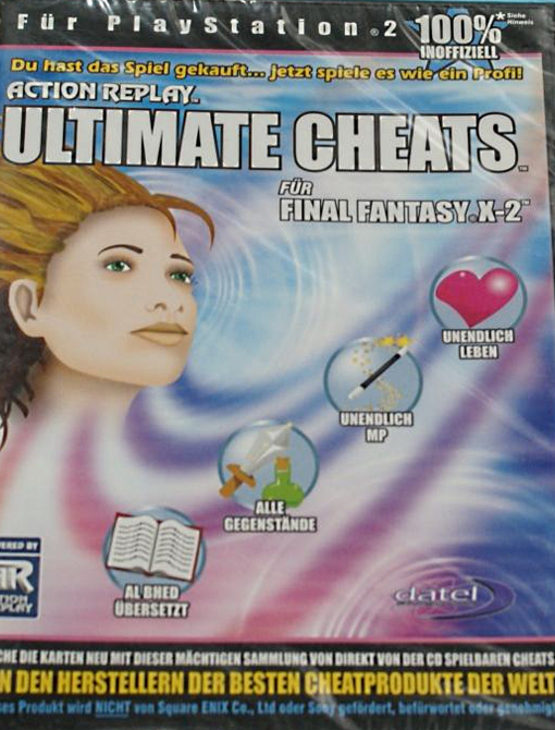
Still, it could have been worse: a character from Final Fantasy X’s direct sequel (Yuna, I guess?) is represented as a human(?) head riding a wave of motion blur, a look that gives the impression of an incredibly fast slug. Don’t let the idea of a flying head distract you from that truly awful haircut, though. Just looking at those straggly bits at the bottom is making my neck itch.
The Legend of Zelda: The Wind Waker

That’s a bit more like it. A large part of Wind Waker does indeed involve Link sailing around on a boat. Not a Roman warship, granted, but it’s a more fitting symbol for the game than helicopters were for Metal Gear Solid 3. Still, that doesn’t explain why Link is sailing across a sea of milk. Unless… oh, I get it, Link and his boat are made of Weetabix. That explains the colour scheme, you see. We’re actually looking at the exciting adventures of a bowl of cereal.
God of War II

Hang on, what? I would never have seen this cover and thought “oh yeah, that’s God of War.” “Muscular bald man” and “monsters” are definitely applicable phrases for the God of War games, so for this cover to include both of those things but still be utterly unrecognisable is kind of impressive. This bloke looks more like the God of Hernias than the God of War, a supervillain whose origin story involves him falling into a vat of synthol. Could the artist have not at least slapped some red tattoos on this Kratos-wannabe rather than just painting his torso black? Oh, I know, you think he’s wearing a vest but take a closer look and you’ll soon realise that there’s no way that’s clothing. I think he was laying in the road and got run over by an asphalt spreader.
Various Super Mario Games

It’s-a me, [Name Redacted]! You can try hiding behind the steering wheel of your kart all you like, Mario, but we still know it’s you, with your (genuinely) iconic cap and your Mickey Mouse gloves. Of course, something has gone horribly wrong with Mario’s body, which might throw you off a little. I know everyone’s favourite plumber is supposed to be a little portly, but here he’s little more than an egg with arms and a head haphazardly bolted on near the top. Perhaps that’s why hiding, he’s overcome with shame. Or he’s worried Sonic’s going to see him and mistake him for Dr. Robotnik.
There is a strange amount of variety in how close these covers get to representing the game they’re intended to work with: this is clearly Mario, and the Twilight Princess cover was a straight-up picture of Link, but the God of War one bears far more similarity to any given 1980 boy’s toy line than, you know, God of War. I wonder why that is? Perhaps some companies were known to be more actively litigious than others, although I doubt it. I think the real answer is simply that no-one making these discs and their cover art really gave a toss.
Nintendo DS / 3DS

It’s a little difficult to see the “artwork” on this one due to the shape of the packaging, but I think you’ll all agree it’s worth the effort just to see what Bowser would look like with a combover. That’s a proper bootleg Bowser, that is: a piece of official art that has been modified just enough to be legally distinct, and in one way it’s even an improvement of the original: Bowser should definitely wear a cape more often. As a bonus, you can see from the right-hand side of the picture that the artists were still having trouble keeping Link’s eyes even roughly the same size, and as a result he looks like he’s having a stroke while trying to do a Dreamworks face.
However, the very best thing about this cover is that it promises cheats for Brain Age. I’m not usually one to tell people how to enjoy the media they consume, but if you’re cheating at a brain training game then surely the only thing you’re cheating is yourself.
Guitar Hero

Don’t get me wrong, I love the Guitar Hero games, but playing along to a rock song with a plastic guitar does take the concept of being in a band and make it look very uncool. It is appropriate, then, that this cover makes playing Guitar Hero look uncool.
Pokemon

Ah, bootleg Pokemon. Now there’s a venerable tradition, bootleg Pokemon have been keeping Chinese knock-off merchants in business for twenty years now. Did I take advantage of Pokemania during my high school years by printing out fake Pokemon cards and selling them to kids at school? Of course not, what kind of terrible person would that make me? Also, its not very financial viable when you consider the costs of printer ink and other materials. Erm, I imagine.
This cover gives us a classic example of some non-official Pokemon, of the kind you’d see adorning market stall goods and news reports about the Pokemon craze that couldn’t get hold of official artwork – slightly altered, enough so that any Pokemon fan would immediately know they’re a) Pokemon and b) not legit Pokemon. So, you’ve got a Piplup with a head so shaggy it looks like it’s attached to a Van der Graaff generator, a Chimchar whose fiery backside won’t prevent it from reading the list of exclusive game codes, a Charizard that’s two levels away from evolving into Pete’s Dragon and a Bulbasaur that’s spent way too long huffing its own spores, if you catch my drift. All in all, some A+ fake Pokemon work.
Metroid Prime

This is my absolute favourite of the bunch, for a variety of reasons. There’s the bizarre proportions, for starters, with a shoulder that attaches directly to the neck and an arm cannon that would reach down to the floor if not-Samus here stood up. There’s the overall look of the thing, a look that screams “Half-Life knock-off” rather than anything to do with Metroid. If you told me there was an early version of Gordon Freeman in that suit, I’d have no trouble believing you. Assuming the early concepts for Freeman stated he was an only vaguely humanoid mass of protoplasmic tissue who didn’t have to worry about bones or joints, that is. The very best component of this image, however, is not-Samus’ pose, the kind of hand-on-thigh, leaning-in pose that makes it look like they’re about to “rap” with the kids about some “heavy issues.” If they made chairs to accommodate such freaks of anatomy, you can bet not-Samus would be sitting in it backwards and saying “hey kids, I know baby Metroids are ‘totes adorbz,’ but there’s nothing adorable about them when they’re siphoning away the life essence of you and your loved ones.”
That’s about it for these Action Replay covers, which is kind of a shame. I’m sure there are yet more wonderful examples out there, but from some unfathomable reason people seem to be reluctant to take pictures of them. Before I go, though, I should point out that these rip-off covers aren’t exclusive to the Action Replay’s later years.

This is the artwork for the Megadrive Action Replay, starring the Techno Kid. I’m guessing the responsible person’s design process was “this product is for massive dorks, so what if we took a massive dork and tried to make him look cool?” They failed, and thus Techno Kid was born. You know how some things are so bad they become good? Well, Techno Kid’s shorts are like that, except they start at bad, go past good and loop right back around to being awful again. Anyway, Techno Kid’s shoes might have clued you in to his secret origin:

He’s copied from this piece of artwork from the first Sonic the Hedgehog. It was the beginning of a proud tradition.